
Useless Covid data analysis riddled with basic flaws
If the vaccines were so effective, why do governments have so much difficulty producing the evidence?


A new analysis by the Australian Government comparing Covid outcomes between vaccinated and unvaccinated Australians was an opportunity to finally provide evidence for repeated claims of the effectiveness of Australia’s vaccine rollout.
But basic flaws render the analysis virtually useless, adding to the pile of ‘bad data’ that authorities continue to pull from to justify their ongoing promotion of the Covid vaccines.
The report, ‘Hospitalisations and deaths following a COVID-19 diagnosis, 2020-2022: a linked data analysis’ by the Australian Institute of Health and Welfare (AIHW) is the first official report to link data on infections, hospitalisation, and deaths stratified by age and vaccination status from most states and territories.1
Until now, federal, state, and territory governments have steadfastly refused to release linked real-world data to support their claims of Covid vaccine effectiveness, blocking Freedom of Information (FOI) requests, and claiming in court to have erased the data so as not to have to hand it over.
Instead, authorities relied on modelling and overseas studies to support their claims, regardless of whether these findings translate to real-world outcomes on the ground in Australia.
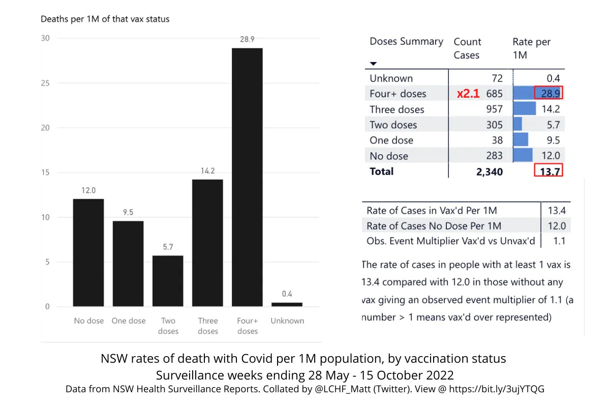
During the pandemic, New South Wales (NSW) Health was the only government department in the country to regularly publish Covid hospitalisation, ICU, and death data stratified by vaccination status, and these reports showed a strong association between more shots and worse outcomes, while in many weeks, not a single unvaccinated person was hospitalised with Covid at all.
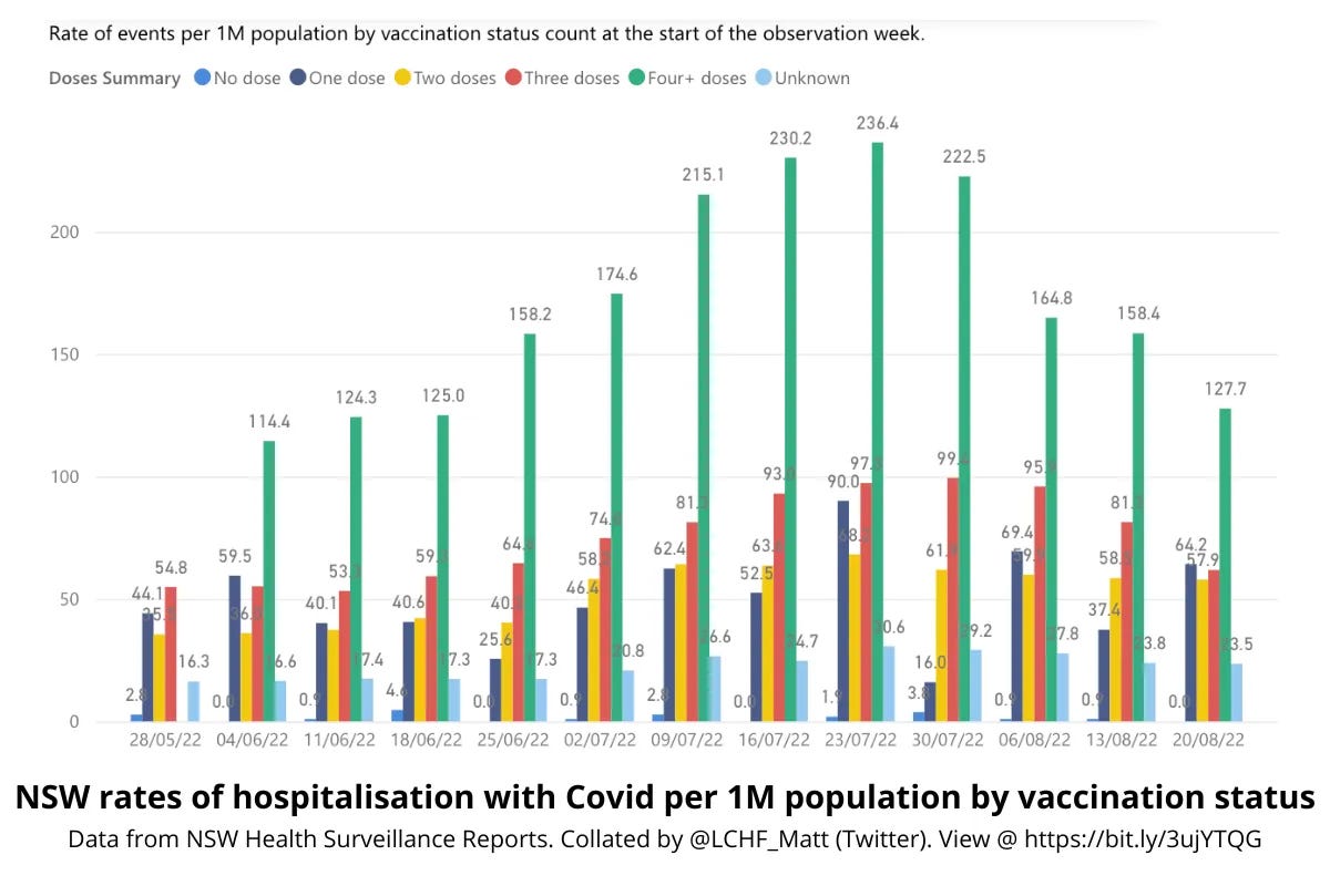
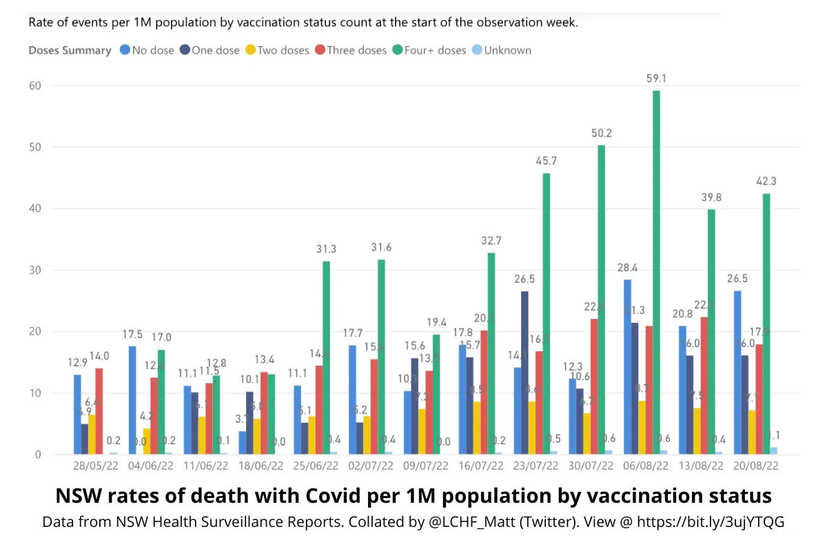
Note that the above graphs show representation in hospital and death outcomes for each dose per million people in the population proportional to vaccination status, not raw number, thereby avoiding the problem of base rate fallacy.
However, NSW Health’s failure to stratify by both vaccination status and age made it impossible to tell if the terrible outcomes for the vaccinated were due to negative vaccine efficacy, as it appeared, or if other factors were at play.2
Coupled with Australia’s record high excess deaths, which started clocking up around the same time as the vaccine rollout, and at least half of which could not be explained away by Covid infections, the lack of hard proof for claims of vaccine efficacy in the Australian population left an information vacuum fast filled by speculation.
Ideally, this new linked data analysis by the AIHW would finally put such speculation to bed. But it doesn’t, and it can’t, due to the same miscategorisation errors that have plagued a multitude of Covid-era studies, making their findings not only unreliable, but potentially dead wrong.
The AIHW analysis: basic miscategorisation errors
The report claims to show that the vaccinated fared much better than their unvaccinated counterparts.

“Covid-19 hospitalisation rates were 4 times as high in unvaccinated older people than those with 3 or more doses,” and “across all age groups, COVID-19 case fatality rates were lower among people who were vaccinated,” are key takeaways, for example.
However, these claims cannot possibly be drawn from the AIHW analysis because:
Vaccinations weren’t counted until 14 days after administration;
An undetermined number of people with unknown vaccination status were counted as unvaccinated; and,
People who had opted out of sharing their vaccination status with third parties were excluded from the analysis altogether.
Per the technical notes at the end of the AIHW report,
“The data on COVID-19 vaccination status in this report was based on data from the Australian Immunisation Register (AIR) in the COVID-19 Register. The AIR is a national register that records vaccines given to all people in Australia, including people enrolled in Medicare or people who had a vaccination record transferred from recognised vaccination providers (such as a general practitioner or community health centre).
“This report considered COVID-19 vaccination status based on the total number of COVID-19 vaccination doses recorded 14 days or more prior to a COVID-19 diagnosis. This is to account for a vaccination taking 14 days to become effective, based on studies showing that a single dose of vaccine offers some protection around 2 weeks after vaccination.”
This means that the ‘zero dose’ category in the AIHW analysis included anyone:
Who had not had a dose;
Who had one dose up to 13 days prior; and,
Whose vaccination status was not recorded or matched with their record in the AIR, i.e.: vaccination status is unknown.
Additionally, anyone who had previously opted out of sharing their information with a third party was excluded from the analysis.
I confirmed with the government that this interpretation of the AIHW methodology for determining dose status and inclusion in the analysis is accurate.
The first error alone - counting the newly vaccinated as unvaccinated (or less vaccinated) - can make a placebo or even an ineffective vaccine appear effective in observational studies, according to mathematician Norman Fenton:
The confounding effect that this and similar miscategorisations can have on misrepresenting vaccine effectiveness has been documented in numerous peer-reviewed articles, with effects estimated to be as high as 50% to 70%.
This kind of categorisation error hides any negative effects that may occur in the first 14 days after receiving a shot, while at the same time artificially inflating the incidence of those effects and any other negative outcomes in the group that has fewer or zero doses.
As a majority of Australians received their first vaccine dose before Covid was circulating in the community, this methodological flaw is unlikely to have skewed the Covid hospitalisation and death outcomes in this AIHW analysis too greatly as far as comparing vaccinated vs. unvaccinated goes.3 It would likely have a greater effect on reported outcomes by dose, where newly boosted people are treated as having fewer shots than they have actually had.
However, the second and third errors - counting some people with unknown vaccination status as unvaccinated, and excluding an undetermined number of others who had opted out of information sharing - are likely to have had a profound effect on the outcome of this particular analysis, maybe even enough to completely invert the reported outcomes.
During the pandemic, most state governments using data from the AIR put hospital patients with unknown vaccination status into the zero dose/unvaccinated category for reporting purposes.
This resulted in headlines to the effect that a third or a quarter of people in hospital were unvaccinated, giving the impression that the unvaccinated were vastly overrepresented in hospitalisation and death statistics, and feeding into the public shaming of the unvaccinated as a burden on the healthcare system.
This was pure misinformation (or disinformation if you believe the reporting error was deliberate).
Simply by looking at the fortnightly Covid surveillance reports of the only state that published Covid data with the zero dose and unknown categories separated out from each other, NSW, it was easy to ascertain a few salient facts:
On any given week, those with unknown vaccination status accounted for around one in four of those hospitalised with Covid (unknowns were a much smaller group in the death data).
Initially (i.e.: in the first several months of reporting), the unvaccinated fared worse in Covid hospitalisation outcomes and fairly equal in deaths to the vaccinated.
As the rollout progressed, the unvaccinated fared much better compared to their representation in the population, with ZERO unvaccinated Covid hospitalisations in some weeks.
Conversely, those who had received more boosters fared considerably worse, being overrepresented in Covid hospitalisations, ICU admissions, and deaths most reporting weeks.
Thanks to X user @LCHF_Matt uploading the fortnightly NSW reports into this live chart, the public was able to visualise these outcomes. What we see is that the unvaccinated are underrepresented on a per capita basis in hospitalisations, ICU admissions, and deaths, while the more shots a person has, the more likely they are to be hospitalised, admitted to ICU, or die with Covid.4
Evidently, bucketing unknowns in with the unvaccinated grossly skewed the reported outcomes from other states, giving the false impression that the unvaccinated were flooding hospitals when in reality, after an initial round of infections, they were mostly doing much better than the boosted.
Moreover, excluding an undetermined number of 'opt-outs’ from the data messes with the denominators for Covid outcomes.
Services Australia, which manages the AIR opt-outs, advised by email that 230,490 people have opted out of third-party information sharing as at 27 May 2025, a number equating to just under 1% of the Australian population.
If we could guarantee that the unknown opt-out subjects were evenly distributed across age and vaccination status, this would not be a problem, but we have no way of knowing the distribution of these opt-outs.
Unknowns: Skewing the data
Readers might counter - but if your vaccination status is unknown in the AIR, doesn’t that mean you’re not vaccinated? Wouldn’t those who have been vaccinated have their doses recorded?
Surprisingly, no, based on the only information publicly available:
According to NSW Health surveillance reports at the time (example), anyone whose details were not an “exact match” to their AIR record was allocated ‘unknown’ status. Reasons for lack of an exact match could include: vaccination overseas; having an interstate address or having just moved house; having a misspelled name on hospital forms; a recent name change (e.g.: marriage); and unvaccinated people who have no record of vaccination in the AIR. As already mentioned, you can also opt out of allowing third parties to access your vaccination records in the AIR, which means that healthcare providers (like a hospital) won’t be able to ascertain your vaccination status. It is unclear whether these opt-outs were allocated to the unknown category in NSW Health reporting, or if they were excluded.
In one week, cross-referencing of NSW data confirmed that all cases in the unknown category were double or triple vaccinated.
In the latter quarter of 2021, NSW Health reported that most unknowns would have had at least one dose: “Cases between October and mid-December with an unknown status are likely to have received at least one dose, but their record could not be matched with AIR.” Read more about these details, with screenshots, at the bottom of this post.
We don’t know how many in the AIHW’s data set were of unknown vaccination status, since under its methodology, the AIHW had no way of identifying this group, aside from excluding the opt-outs.
What we can take from the AIHW report: Not a lot
In light of these basic miscategorisation errors, what can the new AIHW report actually show us about Covid outcomes in the vaccinated vs. unvaccinated? Not a lot.
These errors alone could account for the fact that the AIHW’s analysis produced the total opposite outcomes to NSW Health data.
Still, even if the AIHW had avoided these errors, the analysis would be of little use value. The AIHW assessed only hospitalisations and deaths due to and with Covid - loose definitions requiring a Covid diagnosis up to 14 days prior to, or two days after admission for hospitalisations (capturing stays of overnight or longer to exclude same-day discharges indicative of mild disease), and coding indicating that Covid was an underlying or contributing factor for deaths.
However, the appropriate way to assess vaccine outcomes at population level is to analyse all-cause mortality and hospitalisations, as this is the only way to capture non-specific effects of vaccination.
If, for example, Covid vaccines are associated with a 3.7-fold increase in cardiac events, as was the case in the Pfizer trial, then the vaccine cannot be said to improve health outcomes overall in the vaccinated population - the opposite is true. An analysis focusing only on Covid-related hospitalisations and deaths will fail to capture this full picture.
Australian data scientist Andrew Madry has detailed further problems with the AIHW report on his Substack, Datawise.
A house of cards
The AIHW Covid data analysis is just the latest in a parade of reports and modelling studies that are too flawed to tell us anything, yet are reliably used to prop up the Covid vaccine efficacy house of cards.
To be clear, the AIHW has not made a claim for Covid vaccine effectiveness based on its analysis. Per the report,
“It is important to note that simple descriptive analyses of COVID-19 vaccination in people with COVID-19 conducted in this report cannot be used to infer effectiveness of vaccination for a range of reasons.”
However, it is highly probable that this analysis will be proffered by government departments, academia, and professional bodies as evidence of vaccine effectiveness anyway.
In public and media communications, these institutions regularly quote flawed studies or data that, upon further inspection, do not support their claims of ‘evidence’ of Covid vaccine efficacy.
In Australia, a Monash University (NSW) modelling study of the Delta and Omicron waves claiming to show that the Covid vaccination campaign saved approximately 20,000 lives in NSW alone is frequently wheeled out by the Actuaries Institute and government departments as evidence of the effectiveness of Australia’s Covid vaccine rollout.
However, this study made a similar miscategorisation error to the AIHW analysis, categorising anyone vaccinated as having ‘no effective dose’ until 21 days after administration of a shot.
Substacker Alison Bevege documents other problems with this study, not least that the authors confused case fatality rate (CFR) with infection fatality rate (IFR), thereby grossly overestimating the deadliness of the Covid waves in their modelling.
Another widely-touted study based on South Australia Health data claimed without qualification that the unvaccinated were five times more likely to die from Covid. But upon inspection, the only deaths under the age of 60 were in the vaccinated, and most of the deaths occurred in those aged 80 and older (i.e.: around or above Australia’s average life expectancy of 81 and 85 for men and women, respectively).
On the world stage, a modelling study published in the Lancet claiming to show that Covid vaccines saved nearly 20 million lives in the first year of the rollout has been methodically debunked by researcher Raphael Lataster (on Substack as Okay Then News) in a metacritique published in the Journal of Independent Medicine, yet this will almost certainly not stop authorities and media from continuing to boldly make this unsupported claim.
In email communications, an Australian state health department recently referred me to another AIHW report as evidence that Covid vaccines could not have contributed to excess deaths because the report showed that Australia had a comparatively low excess death rate compared to other countries for 2020-2022.
Indeed, Australia had negative excess deaths in 2020, when our federal and state governments shut us off from the rest of the world, put most of the population under house arrest, and trashed our economy. Madry attributes the lower 2020 figure also to a higher influenza burden the year prior, in 2019.
However, using 2020 data - when there were no vaccines - as evidence that vaccines do not cause excess deaths, is patently absurd. Furthermore, once the vaccines were introduced, the increase in Australia’s excess mortality rate became such an undeniable phenomenon that the Senate conducted an inquiry into the matter.
Show us the data
Perhaps there is data that can show how effective the Covid vaccine rollout was in Australia (and beyond).
To prove this, all authorities need to do is publish hospitalisation and all-cause mortality data stratified by age, vaccination status, and comorbidities. This data should be made available at record level, de-identified.
No Australian state or federal authority has ever done this, leaving many to wonder - why not?
The AIHW data is available for download, but as it is incomplete, aggregated, and incorrectly categorised as discussed in this article, it is of little use in the form in which it has been presented. Researchers may apply to access the data to perform their own analyses, but projects and any pending publication of works must be approved by the AIHW and “relevant data custodians,” per a response received from an email enquiry to the AIHW. We can probably guess what kinds of projects will and won’t be approved.
In Queensland (QLD), the government is set to destroy a globally significant Covid vaccine study biobank that could presumably further support health authorities’ claims of vaccine effectiveness. Yet the QLD Government prefers to destroy the biospecimens and permanently archive the data than to keep the study going and publish the amazing results for the world to see.
And so, Australians are left at square one.
Authorities say the Covid vaccines were very effective, but refuse to produce the data to prove it. If belief requires blind faith, that’s not science - that’s a cult.
To support my work, share, subscribe, and/or make a one-off contribution to my Kofi account. Thanks!
Related reading
3 months of NSW data show it's not the unvaccinated in hospitals with Covid

Is NSW Health aware that there are barely any unvaccinated patients being hospitalised with Covid? In last week’s Covid surveillance report, there were 0 (zero) unvaccinated patients hospitalised with Covid...
4+ doses is the magic number if you want to die with Covid

Man alive! Surely this is not what NSW Health is going for?
A lie in four pictures

NSW Health argues the base rate fallacy to explain why 0 unvaccinated people in hospital means the vaccines are working...
All-cause mortality started trending upwards with vax rollout, not Covid, report finds

Prior to the pandemic, Australians were living longer, with death rates amongst older Australians trending downwards. But in 2021, that trendline upturned, and Australia started chalking up excess mortality at rates not seen since WWII.
Excluding Western Australia and, for some parts of the analysis, the Northern Territory.
For example, the fact that approximately half of Covid-related deaths in NSW occurred in aged care could mean that poor outcomes in the vaccinated elderly were hiding positive vaccine effects in younger age bands (i.e.: Simpon’s paradox).
According to the AIHW, by 14 December 2021, only 229,900 Australians (excluding Western Australia) had had a registered Covid infection. By this time, more than 80% of the population over age 16 had received 2 Covid vaccine doses.
In December 2022, NSW Health stopped reporting on Covid hospitalisations, ICU admissions, and deaths by vaccination status for the stated reason that,
“With most of the population having received at least two doses of vaccine and there being differences in timings of booster dosing across different age groups, the trends between vaccines and outcomes cannot be interpreted using these data.”
thank you Rebekah,
.. and the theater continues
the many unfortunate 'errors' .. this 'confusion' when presenting the data by so many well-paid co-authors, each meant to be triple-checking one another's work, and especially the underlying math basis for the results they collectively advanced .. is not natural error
.. it is part of the entire product placement strategy .. part of the marketing directive .. part of the pharma manifesto
here is Australia's service and prayer .. a litany of confounding effects served-up with a bow on top, surrounded by a false aura of institutional legitimacy .. anointed Fauci acolytes repeating The Science
the errors followed by the errors stacked on top of the errors bound with the incomprehensible confusion on display in this paper by several multi-decade PhDs and a collaborating Professor from Sydney University, is not an unfortunate example of Human error(s) and frailty .. no
on display here is a paper written after the results were determined
a paper that places the names of Melanie Dunford, Claudia Slimings, Renee Foo, Bronwyn Wyatt and Mariam Baksh out front
.. but look under the hood
Kristine Macartney collaborated .. suggesting a source for the twisted turns and torturous abuse of the math
Kristine has served on Australia’s Advisory Committee on Vaccines (TGA’s ACV) and on ATAGI (Australia’s immunization technical advisory group) as an ex-officio member
her industry sponsors include the WHO, GlaxoSmithKline, and favourite of every reader here - Pfizer
.. oh .. and she has received funding from the not-really-benevolent Bill & Melinda Gates Foundation
in other words, with Kristine on board, and as the senior academic scientist able to make (or break) a lesser co-author's career, you can bet your bottom dollar this flagging waving poster child for vaccines made sure the necessary spin we see was edged-in - and to damn with the real math and science - in order to pop-out a paper that can and will be used wrongly to spruik what a fantastic choice Australia's other bureaucrats and Ministers made when choosing to buy Bill's and the WHO's (not-novel but known to kill and maim prior to Covid) products
as Rebekah put it: ".. it is highly probable that this analysis will be proffered by government departments, academia, and professional bodies as evidence of vaccine effectiveness anyway"
no .. no errors or accidental miscategorisations occurred in this paper .. every element and 'finding' and statement in support was carefully crafted .. to deceive
after all, wasn't that the general rule for carrying off a successful Covid pandemic - deception?
Kristine et al have ticked off their box with this paper .. their contribution: "Deception deployed, over and out"
thank you Rebekah and associated sources .. for identifying and placing a spotlight on this never ending flow of Covid pharmaceutical propaganda .. this being yet another article of perhaps thousands now, that will - in time - make for some unbelievable PhD studies and students .. one day .. when it is finally acknowledged the enemy was never Covid, but these types of people .. inside the wire .. appearing to be all so benevolent and good for us
.. just like that one-time adorably cute little vaccine huckster Fauci was seen to be .. remember when everyone thought he was just the bees-knees?
now people around the world have a very different perception of the guy .. and a few choice and accurate names for the fellow .. yes, some real choice names right up there with those given to good ol' Josef Mengele
so what I am trying to say here Folks, is - same same .. same same here, but different
the pharmaceutical complex is global .. it infests Australia's backyard .. it has successfully invaded the bodies of millions of Australians
.. and .. it is deep within Our institutions
reminds me of the opinion about doing a coronial inquest - "you never start one unless you know the result".
I read your description of the 1st, 2nd and 3rd errors of the analysis and consider them not mistakes, but deliberate choices in order to obfuscate, or even change, the underlying result - that is that this rollout was bad, and will continue to be bad, for the people of this country.
But their results does not really show that.
Rubbish data in equals rubbish data out. Using data that sounds the same but is structurally different does indeed result in false signals or squewed results. And can be hard to spot, unless you really dig in. And then you sound like a tin foil hat conspiracy theorist when you document the inconsistencies.
"Authorities say the Covid vaccines were very effective, but refuse to produce the data to prove it. If belief requires blind faith, that’s not science - that’s a cult."
I think the cult like thinking drives the behaviour. The cult will not tolerate any deviance from the group think. The results will always support the cult. The people involved will take personal offence, or even consider it to be an attack, to question the cult.